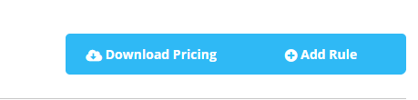
We should add some custom styles for icons being used inside buttons to make them fit better "out of the box". Currently, the icon seems to sit a little too close to the text and doesn't have a great vertical alignment compared to the text. I think we should target some styling specifically for icons being used within buttons to make sure that when using the various button sizes/types the icons always fit well.
Example:
<div class="btn-group btn-group-block">
                    <button class="btn btn-primary btn-sm" v-if="selectedPricingGroup" @click="onRuleSelected()"><i class="icon icon-cloud-download-alt"></i> Download Pricing</button>
                    <button class="btn btn-primary btn-sm" v-if="selectedPricingGroup" @click="onRuleSelected()"><i class="icon icon-plus-circle"></i> Add Rule</button>
                </div>
We should add some custom styles for icons being used inside buttons to make them fit better "out of the box". Currently, the icon seems to sit a little too close to the text and doesn't have a great vertical alignment compared to the text. I think we should target some styling specifically for icons being used within buttons to make sure that when using the various button sizes/types the icons always fit well.
Example: