Create toggle component #215
Description
User Story:
As a developer,
I want to have atomic, reusable components that follow our designs,
So that we can reuse the most code and be efficient and have a good looking site
Acceptance Criteria:
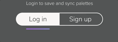
- Create a new toggle component that follows the designs for the login modal
- The toggle should semantically be a checkbox element
- The styling will override this though and appear as a toggle
- Any text should be able to be added to the toggle
- The gradientLine component should also be added