You signed in with another tab or window. Reload to refresh your session.You signed out in another tab or window. Reload to refresh your session.You switched accounts on another tab or window. Reload to refresh your session.Dismiss alert
Default page should be the webstore product list. Now the default page is blank and I had to guess I should click the “Enonic Webstore” link to see something useful.
The side panel looks terrible - it should be wider, with some air around content etc. Would be nice to show the "Enonic Webstore" title here as well, inside the panel. No need for “X” icon either, it's enough that it closes on a click outside. Should be like here:

In admin panel it's a bit better - so use that as a basis - but make sure that the upper part is of the same height as the site header, remove icons for the links and make sure that menu items are vertically aligned with the title (see the screenshot above - should be like that). Also make sure that the links are not underlined.
Change "Enonic Webstore" to not be a link, just the title.
Remove the "Store" icon from the header.
Implement the following links inside the panel:
Home page (to the store's main page)
Shopping cart (to the shopping cart)
My account (empty link at the moment)
When inside the Admin console, there should be no shopping cart icon in the header, "ADMIN" link should be replaced with "WEBSTORE" (leading to the store's main page) and change header background colour to #90A4AE. The title in admin console should be "Enonic Webstore Admin Console"
Don't show "0" over the shopping cart icon, only show it when there are items in the cart.
Default font-family is set to "Roboto" which is a default font of Material-UI, but it doesn't seem like you are downloading the font itself.
Cursor should always change to "pointer" over clickable objects (products on the main page, menu items etc.)
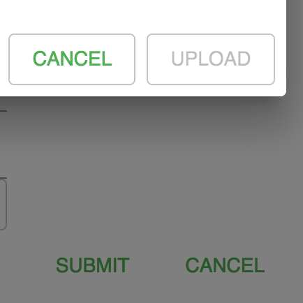
Change "CANCEL" inside product overlay to "CLOSE" and give it a different color, f.ex. lightgray. In general, make sure that the buttons are consistent. Some of your buttons do have borders (image overlay) and some don't (item overlay). "Cancel" should be changed to grey colour everywhere. Same with order of the buttons. If you have cancel to the left, then have it like that everywhere (in client item overlay it's Cancel and Add to Cart but in the admin item overlay it's Submit and Cancel). I prefer subtle "Cancel" on the left and the vivid main action button on the right. Here's an example of inconsistency within the same overlay:
When there are no items in the cart, the text on the cart page should simply say "Your cart is empty", and please add some air around it (no need for the border)
There's something wrong with tooltips. When I click an icon, the tooltip stays visible until I click something else.
Rename fields for an item: Name -> Title, Info -> Description
There should be "Add to Cart" button directly in product boxes on the main page, so that I don't have to open the overlay to add the item.
No need to show "Empty cart" toaster popup when I go to the empty cart page - it's obvious from the text on the page.
Something is very wrong with layout of the admin item list page. The grid is too wide and overflows the border. I think the space is incorrectly used there too. First column - "Items" - it's always empty for me. What is that for? There's absolutely zero value in showing image URL. We should show thumbnail of the image instead. The order of columns should be like this:
Category
Thumbnail (or empty placeholder if no image)
Title
Description (make sure it wraps to several lines)
Active (what you call Visible now)
Delete
There's no need for "Edit" icon. I should be able to click anywhere in the item row to open the overlay (make sure you change cursor to pointer on hover). Of course, clicking the Active checkbox or Delete icon will still do the same as now.
The item list should be sorted by category, and then title.
Bug: If I click Edit on an item, and then click "Add new item" button I will always get the overlay of the first item I opened.
Buttons over the grid look like tabs. Add some air around them and move Save changes and Cancel changes to the right so that "Add new" is separate from them. Do it on all three admin pages.
Fields in the item overlay take half the width, it should take the entire width.
When I create a new item, placeholders of the fields make everything really messy and confusing (the image upload button makes it even worse)
Name and Info are fine, but in the other two fields placeholders are hanging above the fields which makes them look like subtitles of a previous field. Maybe adding more space between the fields can solve this.
In the new item overlay the fields should take the entire width, rename "Custom image" to "Upload image", move it on the same line as Image with "or" between them, something like this:
In the existing item overlay don't show the "Custom image" button and open the "Upload image" overlay by clicking on the item's image
"SUBMIT" button should say "CREATE" for a new item and "UPDATE" for an existing item
Bug: If I create a new item it has a grey background since it's not updated yet. If I now click "Cancel changes", all of the rows become grey.
Mark changed rows with italic font instead of grey background
Something is wrong in the new category overlay...
I don't understand what "Filter" field is used for in a category. Is it like key words that user can search for? Nothing happens when I enter something else into that field and try to filter by it, neither in admin nor in frontend.
Same with "Visible" field for a category. What's the purpose of it? It's always "off" by default. I'd understand if this was used to deactivate the entire category of items on the webstore, but it doesn't seem to have any effect at all.
Change subtitle of the filter field in the admin console from "Search in store" to "Filter the list". Should remain the same in the client part.
It says "blob://..." inside the image overlay
Show image thumbnail instead of URL in the grid of images


In admin panel it's a bit better - so use that as a basis - but make sure that the upper part is of the same height as the site header, remove icons for the links and make sure that menu items are vertically aligned with the title (see the screenshot above - should be like that). Also make sure that the links are not underlined.
When inside the Admin console, there should be no shopping cart icon in the header, "ADMIN" link should be replaced with "WEBSTORE" (leading to the store's main page) and change header background colour to #90A4AE. The title in admin console should be "Enonic Webstore Admin Console"
Don't show "0" over the shopping cart icon, only show it when there are items in the cart.
Default
font-familyis set to "Roboto" which is a default font of Material-UI, but it doesn't seem like you are downloading the font itself.Cursor should always change to "pointer" over clickable objects (products on the main page, menu items etc.)
Change "CANCEL" inside product overlay to "CLOSE" and give it a different color, f.ex. lightgray. In general, make sure that the buttons are consistent. Some of your buttons do have borders (image overlay) and some don't (item overlay). "Cancel" should be changed to grey colour everywhere. Same with order of the buttons. If you have cancel to the left, then have it like that everywhere (in client item overlay it's Cancel and Add to Cart but in the admin item overlay it's Submit and Cancel). I prefer subtle "Cancel" on the left and the vivid main action button on the right. Here's an example of inconsistency within the same overlay:
When there are no items in the cart, the text on the cart page should simply say "Your cart is empty", and please add some air around it (no need for the border)
There's something wrong with tooltips. When I click an icon, the tooltip stays visible until I click something else.
Rename fields for an item: Name -> Title, Info -> Description
There should be "Add to Cart" button directly in product boxes on the main page, so that I don't have to open the overlay to add the item.
No need to show "Empty cart" toaster popup when I go to the empty cart page - it's obvious from the text on the page.
Something is very wrong with layout of the admin item list page. The grid is too wide and overflows the border. I think the space is incorrectly used there too. First column - "Items" - it's always empty for me. What is that for? There's absolutely zero value in showing image URL. We should show thumbnail of the image instead. The order of columns should be like this:
There's no need for "Edit" icon. I should be able to click anywhere in the item row to open the overlay (make sure you change cursor to pointer on hover). Of course, clicking the Active checkbox or Delete icon will still do the same as now.
Name and Info are fine, but in the other two fields placeholders are hanging above the fields which makes them look like subtitles of a previous field. Maybe adding more space between the fields can solve this.