A lightweight, zero-dependency shimmer placeholder component for React Native and Expo.
- ✅ Zero dependencies — uses React Native's core
AnimatedAPI only - ✅ Auto-detects dark / light mode from the system
- ✅ Full TypeScript support
- ✅ Works with bare React Native and Expo
- ✅ Smooth opacity pulse animation — battery friendly
- ✅ Fully customizable via props
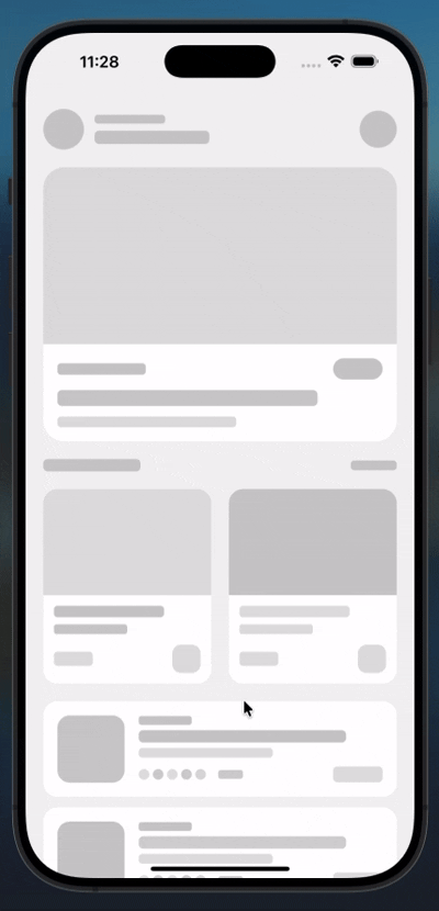
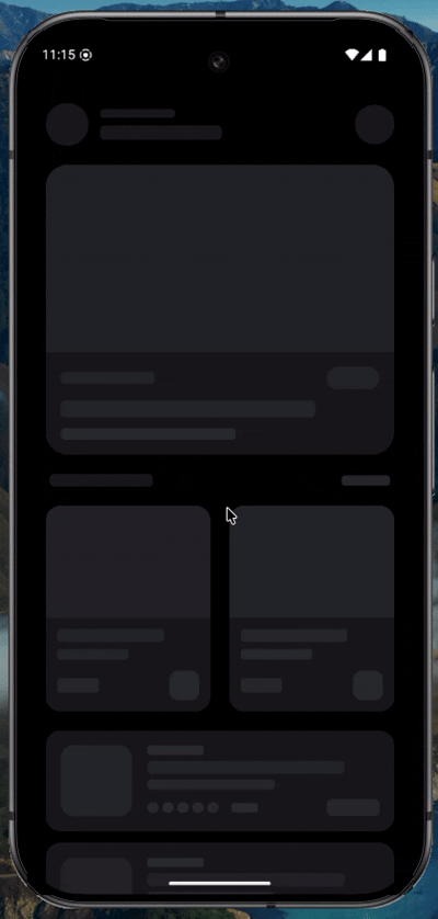
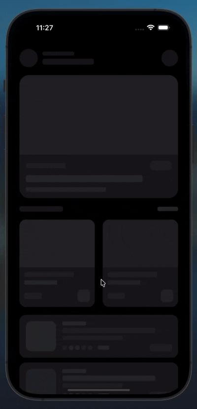
| Android | iOS |
|---|---|
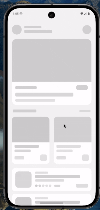 |
 |
 |
 |
Choose your preferred package manager:
# npm
 npm install react-native-modern-shimmer
# yarn
yarn add react-native-modern-shimmer# expo
npx expo install react-native-modern-shimmerNo additional setup required. No native modules, no linking, no extra packages.
import Shimmer from 'react-native-modern-shimmer';

export default function MyScreen() {
  return (
    <View style={{ padding: 16, gap: 12 }}>
      <Shimmer width={200} height={16} />
      <Shimmer width="80%" height={16} />
      <Shimmer width="60%" height={16} />
    </View>
  );
}| Prop | Type | Default | Description |
|---|---|---|---|
width |
number | string |
"100%" |
Width of the shimmer. Accepts px number or "%" string |
height |
number | string |
16 |
Height of the shimmer. Accepts px number or "%" string |
borderRadius |
number |
8 |
Corner radius |
isDark |
boolean |
undefined |
Force dark appearance. If omitted, auto-detects system theme |
baseColor |
string |
theme default | Override the background color |
speed |
number |
1000 |
Animation cycle duration in ms. Lower = faster |
style |
StyleProp<ViewStyle> |
undefined |
Extra styles on the container |
<View style={{ gap: 8 }}>
  <Shimmer width="90%" height={14} borderRadius={4} />
  <Shimmer width="75%" height={14} borderRadius={4} />
  <Shimmer width="60%" height={14} borderRadius={4} />
</View><View style={{ flexDirection: 'row', alignItems: 'center', gap: 12 }}>
{/* Circle avatar */}
<Shimmer width={48} height={48} borderRadius={24} />
{/* Name + subtitle lines */}
<View style={{ gap: 8 }}>
<Shimmer width={140} height={14} borderRadius={4} />
<Shimmer width={100} height={12} borderRadius={4} />
</View>
</View><View style={{ gap: 12 }}>
{/* Card image */}
<Shimmer width="100%" height={180} borderRadius={16} />
{/* Card title */}
<Shimmer width="70%" height={16} borderRadius={6} />
{/* Card subtitle */}
<Shimmer width="50%" height={13} borderRadius={6} />
</View><Shimmer width="100%" height="100%" borderRadius={12} />{Array.from({ length: 6 }).map((_, i) => (
<View key={i} style={{ flexDirection: 'row', alignItems: 'center', gap: 12, marginBottom: 16 }}>
<Shimmer width={52} height={52} borderRadius={12} />
<View style={{ flex: 1, gap: 8 }}>
<Shimmer width="80%" height={13} borderRadius={6} />
<Shimmer width="55%" height={13} borderRadius={6} />
</View>
</View>
))}<Shimmer width="100%" height={16} isDark /><Shimmer width="100%" height={16} isDark={false} /><Shimmer
width="100%"
height={120}
borderRadius={16}
baseColor="#1a1a2e"
/><Shimmer width={200} height={16} speed={600} /><Shimmer width={200} height={16} speed={2000} />The component ships with carefully chosen defaults that look great out of the box on both themes:
| Mode | Base Color | Description |
|---|---|---|
| Light | #cbcbcb |
Neutral cool gray — works on white and light surfaces |
| Dark | #2d2e32 |
Dark slate — works on dark surfaces |
| Platform | Supported |
|---|---|
| React Native (bare) | ✅ |
| Expo (managed) | ✅ |
| Expo (bare) | ✅ |
| iOS | ✅ |
| Android | ✅ |
| Web (react-native-web) | ✅ |
Minimum versions:
- React Native
≥ 0.60 - React
≥ 16.8(hooks) - Expo SDK
≥ 44
Many shimmer libraries require expo-linear-gradient or react-native-linear-gradient which need native linking or an Expo dev build. This library achieves a professional shimmer effect using only React Native's core Animated API — zero setup, works everywhere, including Expo Go.
Pull requests are welcome. For major changes, please open an issue first to discuss what you would like to change.
- Fork the repository
- Create your feature branch (
git checkout -b feature/amazing-feature) - Commit your changes (
git commit -m 'Add amazing feature') - Push to the branch (
git push origin feature/amazing-feature) - Open a Pull Request
MIT © Abu Hasnat Nobin