Inspired by Radial Menu v4 by Learning one.
- Requirements
- Features
- Built-in Menus
- Radify Skin Editor
- How to Use
- Item Object Properties
- Options Object Properties
- Class Methods
- CreateMenu()
- Show()
- Close()
- SetImageDir()
- SetSoundDir()
- CleanupMenu()
- Class Properties
- Media Directories Configuration
- Supported Image Formats
- Supported Sound Formats
- Donate
- License
- Credits
- AutoHotkey v2
- GDI+ Library for AutoHotkey v2
- Customizable Menu Options: Configure images, text, tooltips, item size, skins, and more.
- Custom Click Actions: Assign various click actions to individual items and menus.
- Hotkeys and Hotstrings: Assign custom hotkeys/hotstrings that trigger specific item actions.
- Multi-Level Submenus: Create nested menus.
- Interactive Effects: Display tooltips and glow effects when hovering over items.
- Sound Effects: Add audio feedback for various menu interactions.
- Skin Support: Apply different skins. Compatible with Radial Menu v4 skins.
- Built-in Menu Items: 200+ items including emojis, symbols, websites, system settings, administrative tools, and power management options.
- Emojis Picker: 60+ popular emojis.
- Symbols Picker: 50+ common symbols.
- Websites: 50+ frequently used websites.
- Settings: 15+ system settings (GUID and ms-settings: URI links).
- Tools: 15+ Windows system utilities and administrative tools.
- Power Options: Shutdown, Restart, Sleep, Advanced Startup, and Restart to Safe Mode.
- Power Plans: Set the active power plan.
- System Cleanup: Useful shortcuts for cleaning your system.
Explore all customization options of the Radify class, configure settings, preview skins, and more.
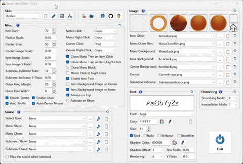
- Browse Skins: Preview all available skins.
- Configure Settings: Configure default and individual skin settings.
- Font and Color Selection: Browse and preview system fonts and colors.
- Sound Preview: Browse and play all available sounds.
- Open the Radify Skin Editor
- Select the "Default" skin (first in the list)
- Configure the settings as needed
- Click the "Edit" button
- Click "OK" or "Apply"
- Open the Radify Skin Editor
- Select the skin you want to modify
- Make your changes
- Click the "Edit" button
- Ensure all desired settings are checked
- Click "OK" or "Apply"
- Open the Radify Skin Editor
- Choose your preferred skin
- Click the floppy disk icon to save it as the default
ItemGlow.pngMenuOuterRim.pngMenuBack.pngItemBack.pngCenterImage.pngSubmenuIndicator.png
Note:
-
Only
ItemBack.pngis required for a skin to be considered valid; if this file is missing, the skin will not be loaded. -
The Skins folder requires
.pngfiles for skin assets. Other image formats can be assigned programmatically or via the Radify Skin Editor. See Supported Image Formats.
Radial Menu v4 skins
-
Unlike Radial Menu v4, which used per-skin
skin definition.txtfiles, all settings are loaded fromPreferences.json. -
To set the submenu indicator image, you can:
- Add a
SubmenuIndicator.pngfile to each skin folder. - In Radify Skin Editor, set a default
SubmenuIndicatorImage, or assign one per skin. - Set
SubmenuIndicatorImageprogrammatically.
- Add a
Image and sound files in the configured directories can be referenced by filename only. See Media Directories Configuration.
- After making changes, reload any script that uses Radify for the changes to take effect.
Radify can be included as a library in any AutoHotkey v2 script to create menus.
For example:
#Requires AutoHotkey v2.0
#SingleInstance

#Include <v2\GDIp\Gdip_All>
#Include <v2\Radify\Radify>

;==============================================

if (!pToken := Gdip_Startup())
    MsgBox('GDI+ failed to start. Please ensure you have GDI+ on your system.',, 'Iconx'), ExitApp()

OnExit((*) => (Radify.DisposeResources(), Gdip_Shutdown(pToken)))

HotIfWinExist('RadifyGui_0_0 ahk_class AutoHotkeyGUI')
Hotkey('Esc', (*) => WinClose(WinExist()))
HotIfWinExist()

;==============================================

Radify.CreateMenu('myMenu', [
    [   ; ring 1
        {image: 'device-manager.png', click: (*) => Run('devmgmt.msc')},
        {image: 'disk-management.png', click: (*) => Run('diskmgmt.msc')},
        {image: 'computer-management.png', click: (*) => Run('compmgmt.msc')},
        {image: 'system-configuration.png', click: (*) => Run('msconfig.exe')},
        {image: 'system-information.png', click: (*) => Run('msinfo32.exe')},
        {image: 'task-scheduler.png', click: (*) => Run('taskschd.msc')},
    ],
    [   ; ring 2
        {image: 'services.png', click: (*) => Run('services.msc')},
        {image: 'registry-editor.png', click: (*) => Run('regedit.exe')},
        {image: 'optimize-drives.png', click: (*) => Run('dfrgui.exe')},
        {image: 'system-image.png', click: (*) => Run('sdclt.exe /BLBBACKUPWIZARD')},
        {image: 'event-viewer.png', click: (*) => Run('eventvwr.msc')},
        {image: 'windows-tools.png', click: (*) => Run('shell:::{D20EA4E1-3957-11D2-A40B-0C5020524153}')},
        {
            image: 'monitor.png',
            click: (*) => Run('resmon.exe'),
            text: 'Resmon',
            tooltip: 'Resource Monitor',
            itemImageScale: 0.35,
            itemImageYRatio: 0.25,
            textYRatio: 0.75,
        },
        {
            image: 'monitor.png',
            click: (*) => Run('perfmon.exe'),
            text: 'Perfmon',
            tooltip: 'Performance Monitor',
            itemImageScale: 0.35,
            itemImageYRatio: 0.25,
            textYRatio: 0.75,
        },
    ],
],
{
    skin: 'AstroGold',
})

Radify.Show('myMenu')
^1::Radify.Show('myMenu')
^2::Radify.Close('myMenu')
Click: Executes the item’s primary action.Right-Click: Executes an alternate action (if defined).Ctrl + Click: Executes theCtrlClickaction if defined; otherwise, it executes the item’sClickaction (if defined), without closing the menu.- Actions can also be launched via
Shift + Click,Alt + Click,Hotkeys, andHotstrings.
Run Radify Menus.ahk to access pre-built menus with 200+ items including emojis, symbols, websites, system settings, tools, and power options. You can create or modify menus and their items by editing the file.
Middle mouse button: Opens mainMenuTray icon clicks:Click: Opens mainMenuDouble-Click: Opens appsMenuCtrl + Click: Opens websitesMenuShift + Click: Opens aiMenuAlt + Click: Opens systemPowerMenu
Note: You can set your own preferred hotkey, hotstring, mouse gesture, or other trigger to open any menu.
Clickon the menu background.Right-Clickon the menu background or the center.Esckey
ClickandDragthe center to reposition the menu.
Items in the Emojis, Symbols, Websites, AI, and Shopping submenus
Click: Executes the primary action.Right-Click: Executes the primary action and keeps the menu open. By default,Ctrl + Clickalso executes the item’sClickaction (if defined), without closing the menu.
Apps submenu
Right-Clickon submenu: Opens Apps > Installed apps in Windows Settings.
Folders submenu
Right-Clickon submenu: Opens This PC
Settings submenu
Right-Clickon submenu: Opens the Windows Settings app
Power Plans submenu
Right-Clickon submenu: Opens Control Panel > Power Options
Cleanup submenu
Clickon Recycle Bin item: Opens the Recycle Bin folder.Right-Clickon Recycle Bin item: Empties the Recycle Bin.
- All shortcuts and behaviors are customizable.
Defines the characteristics and behavior of a menu item.
| Property | Type | Description |
|---|---|---|
Image |
string | integer | Image displayed on the menu item. See Supported Image Formats. |
Tooltip |
string | Tooltip text shown on hover. See AutoTooltip. |
Text |
string | Text to display on the menu item. |
Click |
function object | string | Action to execute when the item is clicked. |
RightClick |
function object | string | Action to execute when the item is right-clicked. |
CtrlClick |
function object | string | Action to execute when the item is ctrl-clicked. If the CtrlClick action is not defined, Ctrl + Click executes the item’s Click action (if defined), without closing the menu. |
ShiftClick |
function object | string | Action to execute when the item is shift-clicked. |
AltClick |
function object | string | Action to execute when the item is alt-clicked. |
HotkeyClick |
string | Hotkey that triggers the Click action. |
HotkeyRightClick |
string | Hotkey that triggers the RightClick action. |
HotkeyCtrlClick |
string | Hotkey that triggers the CtrlClick action. |
HotkeyShiftClick |
string | Hotkey that triggers the ShiftClick action. |
HotkeyAltClick |
string | Hotkey that triggers the AltClick action. |
HotstringClick |
string | Hotstring that triggers the Click action. |
HotstringRightClick |
string | Hotstring that triggers the RightClick action. |
HotstringCtrlClick |
string | Hotstring that triggers the CtrlClick action. |
HotstringShiftClick |
string | Hotstring that triggers the ShiftClick action. |
HotstringAltClick |
string | Hotstring that triggers the AltClick action. |
Submenu |
array | The submenu structure: an array containing one or more inner arrays (rings), each containing at least one item object. See Item Object Properties. |
SubmenuOptions |
object | Options specific to the submenu. See Options Object Properties. |
Properties that can also be set at the item level (override menu-level options):
MirrorClickToRightClickCloseOnItemClickCloseOnItemRightClickItemImageScaleItemImageYRatioSoundOnSelectItemBackgroundImageSubmenuIndicatorImageSubmenuIndicatorSizeSubmenuIndicatorYRatio- All text styling options (
TextFont,TextColor,TextSize, etc.)
Click, RightClick, CtrlClick, ShiftClick and AltClick accept either a function object or a predefined action.
Predefined Actions:
Close: Closes the entire menu tree.CloseMenu: Closes only the current menu.
Special Interactions:
Ctrl + Click: IfCtrlClickis not defined,Ctrl + Clickexecutes the item’sClickaction (if defined) without closing the menu.
Empty Items:
- An empty object
{}inserts a blank space in the menu, which is useful for spacing or alignment.
Configuration options for the menu.
Options apply only to the current menu and are not inherited by submenus, except for Skin and its associated skin-defined options. To set options for a Submenu of a menu item, use the item’s SubmenuOptions property.
Menu options are merged in the following order:
- User-defined options from the
CreateMenumethod options parameter or menu itemSubmenuOptionsproperties. - Skin-defined options.
- Global default options.
Some options support multiple scopes: they can be set at the menu level only, or at both menu and item level, with item-level values overriding menu-level ones.
Scope legend:
Menu: Can only be set at the menu or submenu level (in theOptionsorSubmenuOptionsobject)Both: Can be set at both menu and item level (item overrides menu)
| Property | Scope | Type | Description |
|---|---|---|---|
Skin |
menu | string | Folder in /Skins containing skin assets. Open the Radify Skin Editor to preview all available skins. |
ItemGlowImage |
menu | string | integer | Glow effect image displayed when hovering over a menu item. Requires EnableGlow to be true. |
MenuOuterRimImage |
menu | string | integer | Image for the outer rim of the menu. |
MenuBackgroundImage |
menu | string | integer | Background image of the menu. |
ItemBackgroundImage |
both | string | integer | Background image for individual menu items. Requires ItemBackgroundImageOnItems to be true. |
CenterBackgroundImage |
menu | string | integer | Background image for the center. Requires ItemBackgroundImageOnCenter to be true. |
CenterImage |
menu | string | integer | Image shown in the center of the menu. |
SubmenuIndicatorImage |
both | string | integer | Image indicating a submenu. |
| Property | Scope | Type | Description |
|---|---|---|---|
ItemSize |
menu | integer | Size of menu items (25–250 px). |
RadiusScale |
menu | number | Spacing between rings (0.5–2). |
CenterSize |
menu | integer | Size of center area (25–250 px). |
CenterImageScale |
menu | number | Scale of center image (0–1). |
ItemImageScale |
both | number | Scale of item image (0–1). |
ItemImageYRatio |
both | number | Y-position of item image (0 = top, 0.5 = center, 1 = bottom). |
SubmenuIndicatorSize |
both | integer | Size of submenu icon (5–50 px). |
SubmenuIndicatorYRatio |
both | number | Y-position of submenu icon (0 = top, 0.5 = center, 1 = bottom). |
OuterRingMargin |
menu | integer | Margin between the outermost ring and the edge of the menu (0–75 px). |
OuterRimWidth |
menu | integer | Width of outer rim (0–25 px). |
ItemBackgroundImageOnCenter |
menu | boolean | Apply item background image to the center. |
ItemBackgroundImageOnItems |
menu | boolean | Apply item background image to all menu items. |
| Property | Scope | Type | Description |
|---|---|---|---|
EnableItemText |
both | boolean | Shows text labels on menu items. |
TextFont |
both | string | Font name. |
TextColor |
both | string | Font color in hex (e.g., "FFFFFF"). |
TextSize |
both | integer | Font size (5–100 px). |
TextFontOptions |
both | string | Font styles (bold, italic, strikeout, underline) (e.g., "bold italic"). |
TextShadowColor |
both | string | Shadow color in hex (e.g., "000000"). |
TextShadowOffset |
both | number | Shadow offset (0–5 px). |
TextBoxScale |
both | number | Text box scale (0.5–1). |
TextYRatio |
both | number | Text Y-position (0 = top, 0.5 = center, 1 = bottom). |
TextRendering |
both | integer | Rendering quality for text: |
| - 0: Default | |||
| - 1: SingleBitPerPixelGridFit | |||
| - 2: SingleBitPerPixel | |||
| - 3: AntiAliasGridFit | |||
| - 4: AntiAlias | |||
| - 5: ClearTypeGridFit |
| Property | Scope | Type | Description |
|---|---|---|---|
MirrorClickToRightClick |
both | boolean | Automatically assigns the Click action to RightClick for items that have a Click action but no RightClick action defined. |
FillItemsHitZone |
menu | boolean | Fills a transparent circular hit zone for items when no item background image is rendered. |
FillCenterHitZone |
menu | boolean | Fills a transparent circular hit zone for the center when no center background image is rendered. |
| Property | Scope | Type | Description |
|---|---|---|---|
MenuClick |
menu | function object | string | Action to execute when clicking the menu background. |
MenuRightClick |
menu | function object | string | Action to execute when right-clicking the menu background. |
CenterClick |
menu | function object | string | Action to execute when clicking the center area. |
CenterRightClick |
menu | function object | string | Action to execute when right-clicking the center area. |
These properties accept either a function object or a predefined action.
Predefined Actions:
Close: Closes the entire menu tree.CloseMenu: Closes only the current menu.Drag: Makes the menu draggable. Note: Dragging is only supported with left-click, not right-click.
| Property | Scope | Type | Description |
|---|---|---|---|
CloseOnItemClick |
both | boolean | Closes the entire menu tree when a menu item is clicked. |
CloseOnItemRightClick |
both | boolean | Closes the entire menu tree when a menu item is right-clicked. |
CloseMenuBlock |
menu | boolean | Prevents the menu from closing via the specific HotIfWinExist(WinTitle) example below. Close(MenuID) still works normally. |
HotIfWinExist('RadifyGui_0_0 ahk_class AutoHotkeyGUI')
Hotkey('Esc', (*) => WinClose(WinExist()))
HotIfWinExist()
| Property | Scope | Type | Description |
|---|---|---|---|
AutoCenterMouse |
menu | boolean | Centers the mouse cursor when the menu is shown. |
AlwaysOnTop |
menu | boolean | Keeps the menu always on top. |
ActivateOnShow |
menu | boolean | Activates menu window on show. |
| Property | Scope | Type | Description |
|---|---|---|---|
AutoTooltip |
menu | boolean | Generates the tooltip text if Tooltip is not set, based on item text or image name. |
EnableTooltip |
menu | boolean | Enables tooltips for menu items. |
EnableGlow |
menu | boolean | Enables glow effect on hover. |
| Property | Scope | Type | Description |
|---|---|---|---|
SoundOnSelect |
both | string | Sound played when an item is selected. |
SoundOnShow |
menu | string | Sound played when the menu opens. |
SoundOnClose |
menu | string | Sound played when the menu closes. |
SoundOnSubShow |
menu | string | Sound played when a submenu opens. |
SoundOnSubClose |
menu | string | Sound played when a submenu closes. |
| Property | Scope | Type | Description |
|---|---|---|---|
GuiOptions |
menu | string | AutoHotkey GUI options |
SmoothingMode |
menu | integer | Shape rendering mode: |
| - 0: Default | |||
| - 1: High Speed | |||
| - 2: High Quality | |||
| - 3: None | |||
| - 4: AntiAlias | |||
InterpolationMode |
menu | integer | Image scaling quality: |
| - 0: Default | |||
| - 1: Low Quality | |||
| - 2: High Quality | |||
| - 3: Bilinear | |||
| - 4: Bicubic | |||
| - 5: Nearest Neighbor | |||
| - 6: High Quality Bilinear | |||
| - 7: High Quality Bicubic |
Methods of the Radify class:
Creates a menu with the specified ID, structure, and configuration options.
| Parameter | Type | Description |
|---|---|---|
MenuID |
string | Unique identifier of the menu. |
MenuItems |
array | The menu structure: an array containing one or more inner arrays (rings), each containing at least one item object. See Item Object Properties. |
Options |
object | Configuration options for the menu. |
Shows the menu.
| Parameter | Type | Description |
|---|---|---|
MenuID |
string | Unique identifier of the menu. |
AutoCenterMouse |
boolean | Centers the mouse cursor when the menu is shown. |
Closes the entire menu tree of the specified menu.
| Parameter | Type | Description |
|---|---|---|
MenuID |
string | Unique identifier of the menu. |
SuppressSound |
boolean | Suppresses the menu close sound. |
Sets the directory for images, allowing image files to be referenced by filename only.
| Parameter | Type | Description |
|---|---|---|
DirPath |
string | undefined | The image directory path. If omitted, defaults to RootDir\Images. See Media Directories Configuration. |
Sets the directory for sounds, allowing sound files to be referenced by filename only.
| Parameter | Type | Description |
|---|---|---|
DirPath |
string | undefined | The sound directory path. If omitted, defaults to RootDir\Sounds. See Media Directories Configuration. |
Deletes the specified root menu and all its submenus, freeing all associated resources.
| Parameter | Type | Description |
|---|---|---|
MenuID |
string | Unique identifier of the root menu to delete. |
Properties of the Radify class:
Stores information about the last opened menu. Updated each time a menu is shown via the Show method.
| Property | Type | Description |
|---|---|---|
MouseX |
integer | X-coordinate when the menu was opened. |
MouseY |
integer | Y-coordinate when the menu was opened. |
HwndUnderMouse |
integer | HWND of the window under the mouse when the menu was opened. |
Access example:
; Toggles the always-on-top state of a window
ToggleWindowAlwaysOnTop() {
    info := Radify.lastMenuOpenInfo
    hwndUnderMouse := info.hwndUnderMouse

    try {
        winTitleUM := WinGetTitle('ahk_id ' hwndUnderMouse)
        winClassUM := WinGetClass('ahk_id ' hwndUnderMouse)
    } catch
        return

    if (!winTitleUM || winTitleUM = 'Program Manager' || winClassUM = 'Shell_TrayWnd')
        return

    WinSetAlwaysOnTop(-1, 'ahk_id ' hwndUnderMouse)
    exStyle := WinGetExStyle('ahk_id ' hwndUnderMouse)
    CoordMode('ToolTip', 'Screen')
    ToolTip(winTitleUM '`nAlways on Top "' (exStyle & 0x8 ? 'On' : 'Off') '"', info.mouseX, info.mouseY, 19)
    SetTimer((*) => ToolTip(,,,19), -2500)
}
The directory containing the script Radify.ahk or the compiled executable.
The Windows Pictures folder.
The Windows Music folder.
The Windows Documents folder.
Image and sound files in the configured directories can be referenced by filename only, including the file extension (e.g., downloads.png, tada.wav).
Default directories:
- Images:
RootDir\Images - Sounds:
RootDir\Sounds
RootDir is the directory containing Radify.ahk or the compiled executable.
Directories can be configured in two ways:
-
Through the Radify Skin Editor interface
- Open the Radify Skin Editor
- Click the folder icon
- Select a new directory for images or sounds
-
Programmatically using
SetImageDir(DirPath)andSetSoundDir(DirPath)methods before creating menus.
Available placeholders:
RootDir: the directory containingRadify.ahk.PicturesDir: the Windows Pictures folder.MusicDir: the Windows Music folder.DocumentsDir: the Windows Documents folder.
- File path to a standard image (
ico, png, jpeg, jpg, gif, bmp, tif). - Filename with extension (e.g.,
downloads.png) - searches in the configured image directory. - Image handles:
hIcon: Icon handlehBitmap: GDI bitmap handlepBitmap: GDI+ bitmap pointer
- Icons from resource libraries (
.exe,.dll,.cpl). Use the format:fullPath|iconN, whereNis the icon index. If|iconNis omitted, icon index 1 is used.- Examples:
A_WinDir '\System32\imageres.dll|icon19'A_ProgramFiles '\Everything\Everything.exe'
- Examples:
- Path to a
.wavfile. - Filename with extension (e.g.,
tada.wav) - searches in bothC:\Windows\Mediaand the configured sound directory.
If you find my AHK code useful and would like to show your appreciation, any donation is greatly appreciated. Thank you!

- MIT License
- AutoHotkey - Steve Gray, Chris Mallett, portions of the AutoIt Team, and various others.
- Radial Menu v4 by Learning one
- GDI+
- tic - Created the original Gdip.ahk library
- Rseding91, mmikeww, buliasz, and various others.
- JSON by thqby, HotKeyIt
- Icons and emojis © Microsoft.
Radify
- GetFolderPath by teadrinker
- CalculatePopupWindowPosition by lexikos
- PlayWavConcurrent by Faddix
- ToolTipEx by nperovic
Radify Skin Editor
- GuiCtrlTips by just me
- LVGridColor by just me
- GuiButtonIcon by FanaticGuru
- YACS - Yet Another Color Selector by Komrad Toast
- ColorPicker by Maestrith, TheArkive (v2 conversion)
- GetFontNames by teadrinker
- MoveControls by Descolada (from UIATreeInspector.ahk)
- Control_GetFont by SKAN, swagfag