Louis, a playwriter, created a fundraising campaign for her play Fever, which quickly came close to its fundraising goal. We aim to analyze several thousand crowdfunding projects to uncover any hidden trends that may help Louis in her next campaign. Louis is particularly interested in how different Kickstarter campaigns fared concerning their launch dates and funding goals.
The purpose is to communicate to Louis trends within Kickstarter launch dates and fundraising goal, so she can improve future campaigns’ success.
To continue to help Louise plan her campaign, we need to be more specific with our searches. Using filters, we can update our charts to view data for only theater and plays.
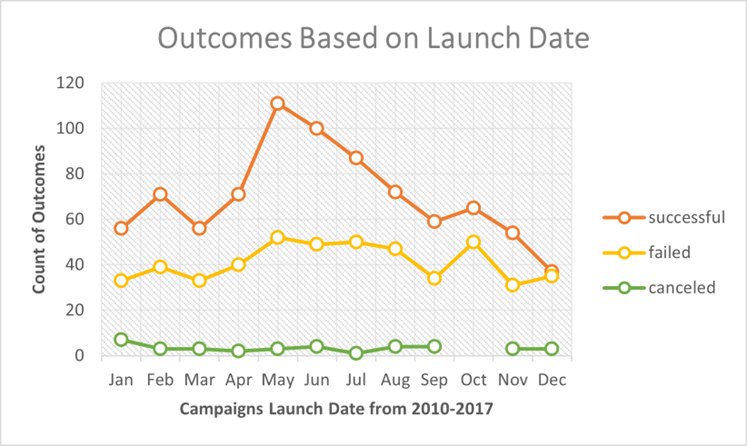
The Outcome Based on Launch Date multiline graph displays the number of theater campaigns’ outcomes each month over seven years. There are three different Kickstarter outcomes: successful (orange), failed (yellow), and canceled (green). We can determine that campaigns that launch their fundraiser over the summer have a higher success rate. Specifically, launching a theater campaign in May had the most effective success rate of 67%. On the other hand, campaigns that launch their campaign towards the end of the year have a higher failure rate. For example, launching a theater campaign in December had the highest fail rate of 51%. During October, there were no canceled campaigns recorded, which does not seem to significantly impact the data. We can draw conclusions about the best and worst possible time to launch a campaign by analyzing the visual trends.
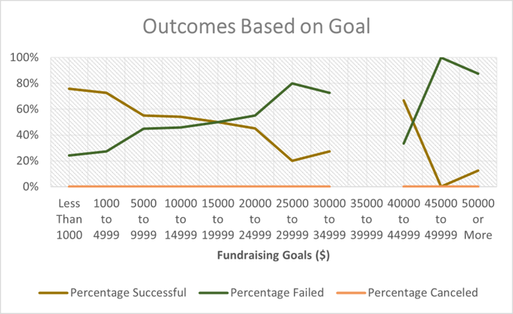
The Outcome Based on Goal multiline graph displays the percentage of theater campaign outcomes based on the monetary fundraising goal. There are three different outcomes: successful (brown), failed (green), and canceled (orange). Unfortunately, no data collected had a fundraising goal between $35,000 and $39,000. We can determine that campaigns with a fundraising goal of less than $15,000 have a higher success rate. Specifically, campaigns with a goal of less than 5000 had the highest average success rate of 75%. Even though the chart displays that fundraising goals between $45,000 to $49,999 had a 100% success rate, I believe it is an outlier in the data set that should be disregarded in this analysis. On the other hand, fundraiser goals that is more than $20,000 have a higher percentage of failing. Therefore, based on the data provided, we can conclude that smaller fundraising goals have a higher chance of succeeding.
The COUNTIFS() function was the most challenging task encountered when creating this analysis. The COUNTIFS() function collected the outcome and goal data for the “plays” subcategory. Typing the formula, extending the formula, and copying the formula to other cells was very tedious. I was hoping to find an easier was to write this function without so much editing, but I was not successful, and I had to go line-by-line to correct.
-
What are two conclusions you can draw about the Outcomes based on Launch Date? Launching a theater campaign in May had the greatest success rate of 67%. Launching a theater campaign in December had the greatest fail rate of 51%.
-
What can you conclude about the Outcomes based on Goals? Campaigns that had a goal of less than $5000 had an average success rate of 75%, had the highest success rate. Campaign that had a goal of more than $50000 had the highest fail rate.
-
What are some limitations of this dataset? I believe that there were several limitations to the dataset. The top three limitations of the data set not enough data of the donors, a description of the spotlight and staff pick data, and the type of graph used to understand the outcome based on goal. First, I believe significant trends could have been determined by collecting the types of donors that donated to Kickstarter campaigns. We could have prioritized our target market of donors if we were able to analyze different types of donors from individual donors to corporate donors. Secondly, the spotlight and staff pick observations could not be analyzed because the purpose of these data entries was not made clear. I believe being able to optimize the analysis by discovering insights on available data is important. Finally, the line graph for the Outcome Based on Goal was not the best visual to analyze trends. Line graphs are best used to determine changes over time. I believe a bar graph would have made a stronger input that could clearly communicate the success and fail rate of Kickstarter campaigns.
-
What are some other possible tables and/or graphs that we could create? I believe a box and whisker chart would help determine measures of central tendency and spread communicating outliers that skew analysis for Kickstarter launch dates and fundraising goals.