


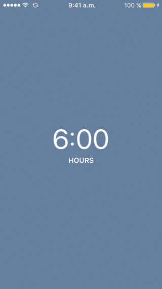
PannablePickerView lets the user select a numeric value moving its finger up and down inside the control.
Built as a better way of handling value selection from a finite range (than UISlider and other alternatives), you can embed it to a full screen app, inline on a TableView or as a UITextField's inputView substitution! (read: awesome in-app custom keyboard). Check out the example project for more.
Customizable, you can change sizes, colors, units, prefix/suffix and more.
- Swif 4.0 support
- Via CocoaPods:
pod "PannablePickerView"- Manually:
- Clone this repo or download it as a .zip file
- Drag and drop PannablePickerView.swift to your project
- From Storyboard:
- Drag and drop and UIView and name its Custom Class property as "PannablePickerView".
- Asign an IBAction to its "Value Changed" control event.
- Programatically:
- Create an instance of it and add it to a view.
- You can either asign a frame to it or create NSLayoutConstraints.
- Add a selector for its .ValueChanged control event.
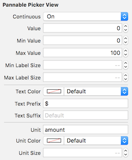
Thanks to @IBInspectables, you can customize its properties right on Storyboard:
You can also always do it programatically, of course.
@IBInspectable public var continuous:Bool = falseDetermines wether the picker's value moves continuously or in discrete steps. Default value is false.
@IBInspectable public var value:DoubleCurrent selected value. Affected by 'continuous', it could be a decimal number. This is the property you should pay attention to at 'Value Changed' control event. Default value is 0.
@IBInspectable public var minValue:Double = 0Minimun value. Default value is 0
@IBInspectable public var maxValue:Double = 100Maximun value. Default value is 100
@IBInspectable public var minLabelSize:CGFloat = 30.0Minimum font size for shown value at panning. Default value is 30
@IBInspectable public var maxLabelSize:CGFloat = 54.0Maximum font size for shown value at the center. Default value is 54
@IBInspectable public var textColor:UIColor = UIColor.whiteColor()Text color for presented value. Default value is white
@IBInspectable public var textPrefix:String = ""Prefix for shown value. Default value is ""
@IBInspectable public var textSuffix:String = ""Suffix for shown value. Default value is ""
@IBInspectable public var unit:String = ""Unit presented below shown value. Default is ""
@IBInspectable public var unitColor:UIColor = UIColor.whiteColor()Text color for unit. Default is white
@IBInspectable public var unitSize:CGFloat = 14.0Font size for unit. Default is 14
optional func pannablePickerViewDidBeginPanning(sender:PannablePickerView)Triggered when user has began interacting with the control
optional func pannablePickerViewDidEndPanning(sender:PannablePickerView)Triggered when users has ended interacting with the control
- iOS 9.0 or later
- Xcode 9.0 or later (Uses Swift 4.0 syntax)
Diego Cruz, diego.cruz@icloud.com
PannablePickerView is available under the MIT license. See the LICENSE file for more info.