Group member: Jun Liu, Jiajun Wang
Using jupyter notebook
Pollution Analysis Part A.ipynb # hypothesis 1, 2, 3
population&gdp.ipynb                     # hypothesis 4, 5
crime_pollution_corr.ipynb               # hypothesis 6
Note: Crime_Data_2010_2017.csv(375MB) is too large to be uploaded to the repository, and is used in the last notebook (crime_pollution_corr.ipynb). Please download it from https://www.kaggle.com/datasets/cityofLA/crime-in-los-angeles
US Pollution 2000-2021 (pollution_2000_2021.csv 93.8 MB)
CO, NO2, O3, and SO2 pollution data in the USA between 2000-2021 from the EPA
https://www.kaggle.com/datasets/alpacanonymous/us-pollution-20002021
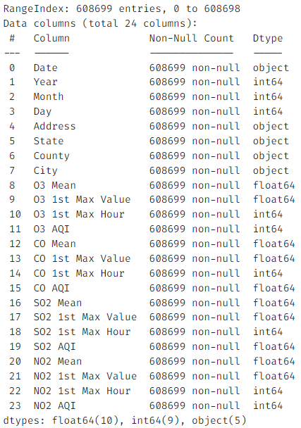
- United States Cities Database
- US GDP 1997 -2021
- US Population 2020
- LA Crime Records 2000-2021
- Air pollution varies by region
- Air pollution has a time difference
- There is a relation between population and air quality.
- There is a relation between state GDP and air quality.
- No relation between crime case number and air quality per day.
- The cities with the worst air quality in the last 5 years are different from the cities with the worst average air quality in the past 20 years?
- Air quality in U.S. cities has deteriorated considerably over the past 20 years?
- Air quality in U.S. cities has improved a lot over the past 20 years?
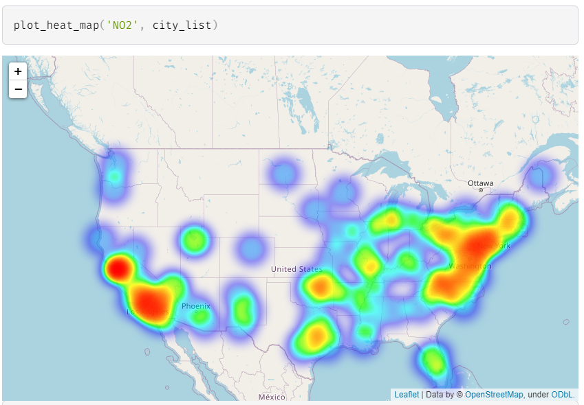
Using the average AQI in cities and the longitude and latitude, we plot the heat maps for each pollutant in the United States.
Conclusiont: From the heat map, it can be seen that severe air pollution appeared in several major urban agglomerations, such as California, New York, and Chicago.
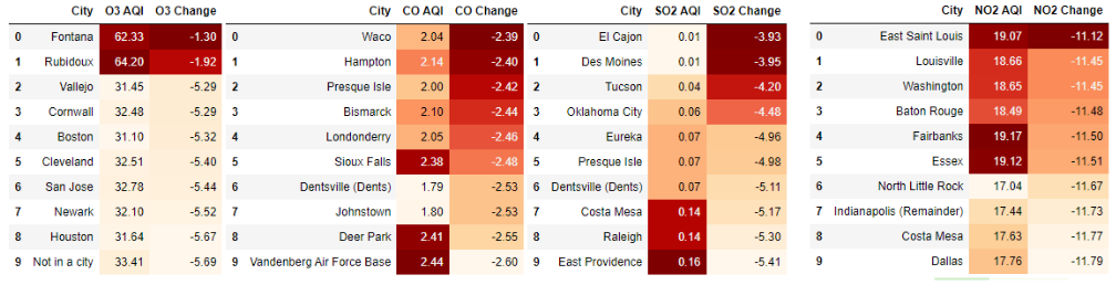
Conclusion 1: For each air pollutant, almost all cities with the highest AQI of each air pollutant are different.
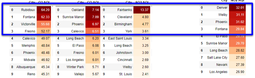
Conclusion 2: Comparing the average of past 20-year and that of past 5-year, almost all cities with the highest AQI of each air pollutant have changed.
1.2.1 The cities with the worst average air quality in the past 20 years
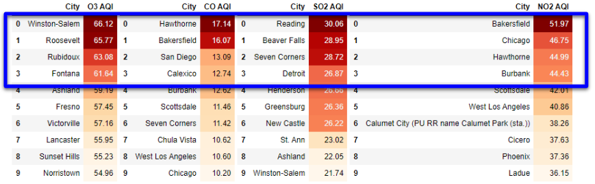 1.2.2 The cities with the worst air quality in the last 5 years
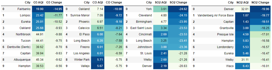
Calculate the change of each pollutant over the past 20 years:
Change = AQI (Year2016-2021) - AQI (Year2001-2010)
Conclusion 1: The highest values of increase for each pollutant are all negative.
Conclusion 2: The average AQI level in all cities has decreased, reflecting the overall improvement in air quality in the United States over the past two decades.
1.2.1 The cities with the highest increase during the past 20 years
 1.2.1 The cities with the lowest increase during the past 20 years
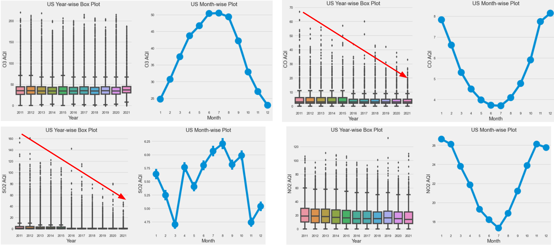
Visualize the overall average pollutant AQI in year-wise box plots and monthly plots.
Conclusion 1: In the year-wise box plots, AQI(SO2) and AQI(CO) have clearly decreased over the past 10 years.
Conclusion 2: In the monthly plots, each air pollutant has a clear seasonal trend. The peaks of O3 and SO2 appear in summer, while the peaks of CO and NO2 appear in winter.
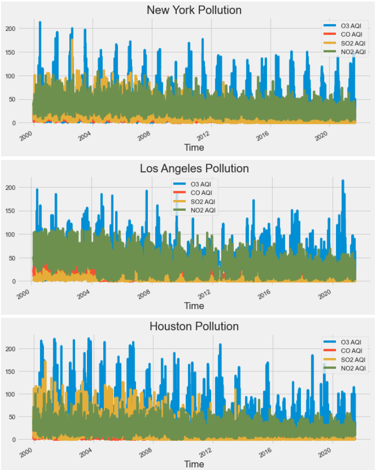
Visualize pollutant data for several largest cities in the United States, such as 'New York', 'Los Angeles', and 'Houston'.
Conclusion: A clear seasonal trend can be found for each city as well, although the magnitude of rise or fall is not significant in the graphs.
Visualize pollutant data for several largest cities in year-wise box plots and monthly plots.
Conclusion: Certain pollutants in some cities showed opposite trends to the overall data. For example in New York, the peak of SO2 occurs in winter rather than summer, although the trends of other pollutants are the same as overall.
1.3.1 The year-wise box plot and monthly plot of SO2 in New York
 1.2.1 The year-wise box plot and monthly plot of SO2 in the US
- There is a relation between population and air quality.
- There is a relation between state GDP and air quality.
- No relation between crime case number and air quality per day.
This part we have 3 hypothesis total, and for each one we have another new dataset to compare its relation with the air quality. The frist two are to explore it from two related fields and the last one is from two unrelated fields(in common sense)
Method:1. for each hypothesis, we used data normalization to make sure the data values' scale is in a same level (helping to plot in one visula). Part of codes below: min_max_scaler = lambda x: (x-np.min(x))/(np.max(x)-np.min(x)) standardlize_p_poll = p_poll.apply(min_max_scaler).sort_values('population',ascending=False) 2.the method we using for first two hypothesis is plot.() to show their relation in direct ways. 3. for the last one we used .corr() and .osl()[Ordinary Least Squares regression]
Result Criteria: .corr() : value > 0: positive correlation value < 0: negitive correlation 0 - 0.2: weak correlation 0.2 - 0.6 : normal correlation 0.6 - 1.0: high correlation
.osl(): p-value < 0.05 & r-square close to 1 means that is a good regression model.
- There is a relation between population and air quality. We are using popluation of each state of US of 2020 for this hypothesis, so we just gropu two data by state first and then join two dataframe and get the result.
Result:
-pollution.jpeg)
this visual shows the relation between CO and population changes in 50 states, the line of CO is fulctuated but its total trend is downward.
.jpeg)
Conculsion: The state with high population has relatively high carbon monoxide AQI. The hypothesis is right!
- There is a relation between state GDP and air quality.
The dataset of GDP including 1997-2020's GDP of each state, so we have two comparison of this experiment.
- Choosing one year and comparing all state’s GDP and Air Quality Index(AQI)(By Year)
- Choosing one state and comparing GDP’s growing and AQI changes over 20 years.(By State)
Result(by Year):
.jpeg)
Conculsion: State with high GDP has a relatively high CO AQI.
Result(by State):
.jpeg)
.jpeg)
We've chosen California and Texas(two state with highest GDP) to show the relation with air quality. The results has some similarity: Air content of CO, SO2 and NO2 is negatively correlated with the growth of GDP, and they the difference of the O3's trend, which a positive relation with CA and opposite for TX.
Conclusion: In one state, with the GDP is growing, the air quality is being better! The hypothesis is right!
Also, one thing interesting: to see the trend at 2020, both of these two states' GDP is stopping growing and have a little reduction(Because Covid-19), and correspondingly the air quality shows their corrlate change, which may support our conclusion.
- No relation between crime case number and air quality per day.
The Crime case number and the air quality is from two unrelated fields, so we assume there is no relation between them.
The dataset including over one million raws which has date(precise to day), crime description, so for this part we also have two comparison.
- Count the number of crimes per day and analyze its relationship with daily air quality(All Case)
- Set ‘crime description’ == ‘with weapon’ and analyze(Some Case)
Result(All Case):
Correlation(~Case number): SO2 Mean: 0.19 O3 Mean: 0.11 CO Mean: -0.13 NO2 Mean: -0.06
Just showing a weak corrlation(Like we guess before), but I'm inspired by the SO2 Mean:0.19 so I decide to add one more limitation to some case experiment, which set the SO2 > 0.8
Ordinary Least Squares regression (OLS):
.jpeg)
The r-square is 0.03 so this is not a good model.
Result(Some Case): # SO2 > 0.7 & ‘Crime Description’ like ‘Weapon’
Correlation(~Case number): SO2 Mean: -0.13 O3 Mean: 0.51 vs 0.11 4 times than before CO Mean: -0.45 vs -0.13 3 times than before NO2 Mean: -0.43 vs -0.06 7 times than before
Showing a normal corrlation with the air quality, though the result is not a good enough, it improved a lot.
Ordinary Least Squares regression (OLS):
.png)
The r-square is 0.03 so this is not a good model.
Conslusion: the corr() function show us a good result which the crime case number per day has a normal relation with the air quality that day, especially the SO2 is over 0.7. Hypothesis is wrong !