[design-doctor test] mem0-4837: Self-hosted dashboard and admin auth - #2
Conversation


Add a production-ready dashboard and auth layer to the self-hosted
server. Forked from platform/frontend/ and stripped of Cloud-specific
code (multi-tenancy, OAuth, PostHog, billing).

Backend:
- SQLAlchemy models (User, APIKey, Invite) with Alembic migrations
- JWT + API key auth with ADMIN_API_KEY backward compat
- Auth, API key, team, and stats routers
- CORS middleware for dashboard origin

Dashboard (Next.js 15, forked from platform/frontend/):
- Same design system (tokens, fonts, shadcn/ui components)
- Email/password login with JWT via httpOnly refresh cookie
- Setup wizard (admin account, providers, API key, test)
- Pages: dashboard, memories, search, api-keys, team, config, settings
- 5 locked teaser pages (categories, graph, webhooks, analytics, export)
- Upgrade nudges with localStorage dismissal

Infrastructure:
- Docker Compose: dashboard service with health check, init-db.sh
- README three-path table (library / self-hosted / cloud)
- Library log message on local-storage instantiation
- Add PYTHONPATH to docker-compose for mem0 package resolution
- Pin bcrypt==4.0.1 (passlib compatibility with newer bcrypt)
- Add pydantic[email] for EmailStr validation
- Add Makefile with up/down/clean/logs/seed/health targets
- Add scripts/seed.sh for quick dev account creation
- Remove dead code: unused imports, reducers (memory, settings, filter),
  hooks (useMemory), constants (common, state, events), closeSidebar
- Fix type safety: replace `any` selectors with RootState, type dispatch
  as AppDispatch, remove `as any` cast
- Add require_auth dependency to eliminate repeated null-check guards
- Import ADMIN_API_KEY from auth.py instead of duplicating in main.py
- Use Literal["admin", "member"] for invite role validation
- Rename navWrapper.tsx to nav-wrapper.tsx (kebab-case consistency)
- Remove trailing slashes from router paths and api-endpoints.ts
- Replace Optional[X] with X | None in auth.py
- Remove redundant redux-thunk dependency
- Remove leftover Cloud comments (tsconfig warning, APOC comment)
- Add responsive grid breakpoint to dashboard stats
- Recreate missing lib/utils.ts, lib/auth.tsx, lib/types.ts
…ockfile

- Setup step 2 now uses api instance (sends auth header) instead of raw
  fetch, and checks response status before advancing
- Setup step 3 uses api.post instead of raw fetch with manual token
- Middleware checks /auth/setup-status for root, login, and setup routes:
  redirects to /setup if needsSetup, blocks /setup after setup complete
- Remove package-lock.json (keep yarn.lock per platform convention)
- Simplify setup wizard step indicator condition
- Remove excess comment from add_memory exception handler
- Replace verbose update_memory docstring with one-liner
- Remove dead lib/types.ts (MemoryObject unused)
- Add EmptyState component with theme-aware SVG illustrations
- Add TableSkeleton loading states to memories, api-keys, and team pages
- Add empty states to memories, api-keys, and search pages
- Add Mem0 logo and improved layout to login page
- Add step titles inside setup wizard cards
- Use semantic design tokens in locked page mockups
- Add responsive grid breakpoints to locked page previews
- Fix dark mode: replace hardcoded bg-black/5 with semantic token
- Skip internal admin routes (/auth, /stats, /api-keys, /requests,
  /configure) from RequestLog so ops_today no longer inflates on
  every dashboard refresh.
- Count total memories from the live pgvector store instead of the
  unused sqlite history DB (which was always empty in containerized
  deployments).
- Allow GET /memories without an identifier; dashboard memories page
  now lists all memories by default and exposes user_id as an
  optional filter.
- Remove Graph Memory from the sidebar and delete its route.
…r OSS

- Add src/types/api.ts with shared Memory, ApiKey, SearchResult, ApiRequestLog, DashboardStats types; remove inline duplicates across pages
- Add useApiQuery hook wrapping loading/error/toast pattern; migrate memories, api-keys, requests, configuration, useDashboardStats
- Replace any + ts-ignore with unknown + getErrorMessage in api-keys, search, copy-button
- Swap native confirm() for DeleteConfirmationModal on API key revoke
- Fix upgrade-banner hydration flash via mounted gate
- Surface silent catches in setup and configuration pages
- Wire htmlFor/id on login-form and setup form labels
- Delete unused auto-resize, autoResizeTextarea, and typo'd collabsable files
- Enable ESLint in next build with next/core-web-vitals config
…board-auth

# Conflicts:
#	README.md
#	mem0/memory/main.py
#	server/main.py
…sts the default route

Delete the dashboard overview page and its supporting code (useDashboardStats
hook, stats Redux slice, DashboardStats type, STATS_ENDPOINTS) along with the
backend /stats/overview router that exclusively served it. Middleware now
redirects /dashboard → /dashboard/requests, and login/setup flows land users
directly on the requests page.
The 'Generate API Key' step created the key and jumped straight to the
test step, leaving the unreachable key-display UI. Stop auto-advancing
so users can copy the key before continuing.
The LLM provider/model/api-key inputs on the Configure step wrote to the
process-memory-only /configure endpoint, so anything entered was lost on
container restart. The server already treats env vars as the source of
truth. Surface that clearly: show the effective provider, model, and
embedder as read-only fields with a pointer to supported-provider docs,
and drop the misleading API key input and the unused handleStep2 POST.
Wrap each step's UI in a <form onSubmit> with type='submit' buttons so
Enter advances the flow from any focused input, matching the login-form
pattern.
Aggregate distinct user_id/agent_id/run_id values across memory payloads
and expose them as entities, matching the hosted platform's Entities
concept. Adds GET /entities for listing with memory counts and
DELETE /entities/{type}/{id} which cascades through Memory.delete_all.
The dashboard page reuses the existing DataTable, EmptyState, and
DeleteConfirmationModal patterns and slots into the Activity nav group.
Self-hosted doesn't expose the search UI. Delete the search page, the
Search nav entry, the SearchResult type, and MEMORY_ENDPOINTS.SEARCH.
The backend /search endpoint is untouched since it's part of the public
Mem0 API.

RedesignRequests
Sign-in
Prompt to build with AI |


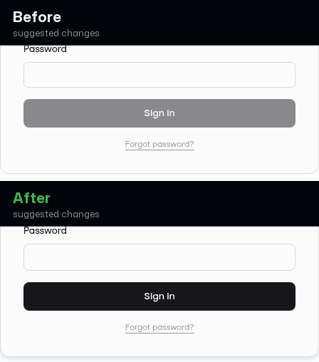
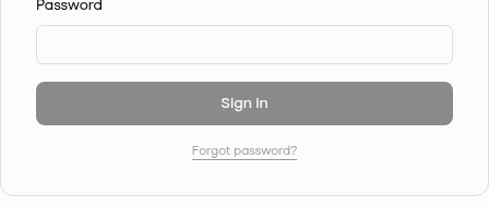
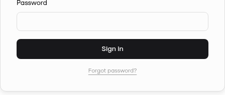
Sign-in button now looks ready, not brokenBefore, the Sign In button was greyed out on first load, so the sign-in screen read as disabled or broken before you'd typed anything. Now it's a solid, confident button that clearly invites you to act, with validation shown only when you submit. Prompt to fix with AI |
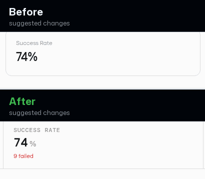
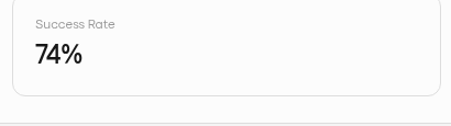
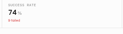
Compact metric strip with more useful detailBefore, the three stat cards were large and mostly empty, showing just a single number each. Now they're a tight metric strip where each figure carries a helpful second line — successful count, failed count in red, and peak latency — so you learn more at a glance without the wasted space. Prompt to fix with AI |
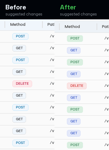
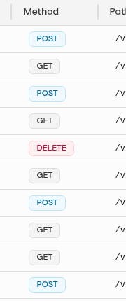
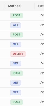
Method pills use consistent, on-brand colorsBefore, the method pills used generic colors that didn't match the rest of the app. Now they use the product's own request colors so green, blue, amber, and red carry consistent meaning across the log and the wider product. Prompt to fix with AI |
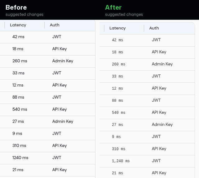
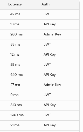
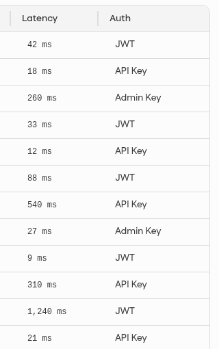
Latency values are easier to scan and compareBefore, latency numbers were plain text and large values like 1240 ms ran together. After, they use a monospaced, aligned format with a thousands separator (1,240 ms), so the column reads cleanly and slow requests are easy to spot at a glance. Prompt to fix with AI |
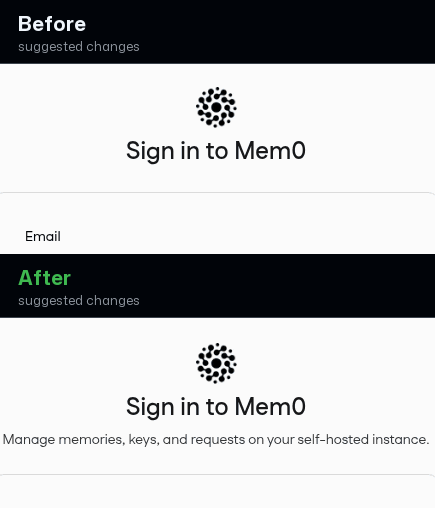
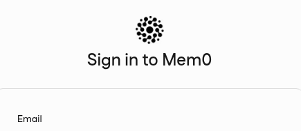
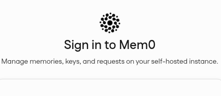
Sign-in now explains what you're signing intoBefore, the sign-in card jumped straight from the title to the email field with no context. After, a one-line subtitle under 'Sign in to Mem0' tells you what the dashboard is for, so the screen feels finished and intentional rather than bare. Prompt to fix with AI |

|
@softlight take another look |
![softlight[bot]](https://avatars.githubusercontent.com/in/1467739?s=60&v=4)
| return "border-amber-200 bg-amber-50 text-amber-700 dark:border-amber-900/40 dark:bg-amber-950/40 dark:text-amber-300"; | ||
| } | ||
|
|
||
| return "border-emerald-200 bg-emerald-50 text-emerald-700 dark:border-emerald-900/40 dark:bg-emerald-950/40 dark:text-emerald-300"; |

There was a problem hiding this comment.
Status badges use raw palette colors instead of the dashboard's status colors
These request-status badges are painted with generic Tailwind palette colors (emerald, rose, amber), so on screen the greens and reds are a different hue from every other success/error color in the dashboard and won't track the theme. The dashboard already has semantic status colors for exactly this — positive (surface-positive-primary / onSurface-positive-primary), danger (surface-danger-primary / onSurface-danger-primary), and gold (memGold) — which the login error banner, toasts, and this page's own default branch already use.
Prompt to fix with AI
This is a comment left during a design-system review.

Comment:
**Status badges use raw palette colors instead of the dashboard's status colors**
These request-status badges are painted with generic Tailwind palette colors (`emerald`, `rose`, `amber`), so on screen the greens and reds are a different hue from every other success/error color in the dashboard and won't track the theme. The dashboard already has semantic status colors for exactly this — positive (`surface-positive-primary` / `onSurface-positive-primary`), danger (`surface-danger-primary` / `onSurface-danger-primary`), and gold (`memGold`) — which the login error banner, toasts, and this page's own default branch already use.

Issue:
getStatusClassName returns hardcoded Tailwind palette classes (border-rose-200/bg-rose-50/text-rose-700, border-amber-200/bg-amber-50/text-amber-700, border-emerald-200/bg-emerald-50/text-emerald-700 plus dark variants) for 5xx/4xx/2xx status badges.

Suggested fix:
Map status to the semantic color tokens defined in server/dashboard/tailwind.config.ts and used app-wide: danger (surface-danger-primary / onSurface-danger-primary), positive (surface-positive-primary / onSurface-positive-primary), and memGold-* for warnings — matching login-form.tsx (bg-surface-danger-primary text-onSurface-danger-primary) and sonner.tsx (surface-positive-primary / surface-danger-primary).

Where:
server/dashboard/src/app/(root)/dashboard/requests/page.tsx (getStatusClassName)

How can I resolve this? Keep the fix scoped to the PR-touched UI and preserve existing design-system patterns.
| const getMethodClassName = (method: string) => { | ||
| switch (method.toUpperCase()) { | ||
| case "POST": | ||
| return "border-sky-200 bg-sky-50 text-sky-700 dark:border-sky-900/40 dark:bg-sky-950/40 dark:text-sky-300"; |
There was a problem hiding this comment.
HTTP method badges use raw palette colors instead of the dashboard's semantic colors
The POST/PUT/DELETE method badges are colored with generic Tailwind palette values (sky, amber, rose), so they render as a different blue/red than the rest of the app and won't follow the theme — while the default branch right below them correctly uses the product tokens (surface-default-secondary). Use the same semantic color tokens as that default branch: info (surface-info-primary / onSurface-info-primary), danger (surface-danger-primary / onSurface-danger-primary), and gold (memGold).
Prompt to fix with AI
This is a comment left during a design-system review.

Comment:
**HTTP method badges use raw palette colors instead of the dashboard's semantic colors**
The POST/PUT/DELETE method badges are colored with generic Tailwind palette values (`sky`, `amber`, `rose`), so they render as a different blue/red than the rest of the app and won't follow the theme — while the default branch right below them correctly uses the product tokens (`surface-default-secondary`). Use the same semantic color tokens as that default branch: info (`surface-info-primary` / `onSurface-info-primary`), danger (`surface-danger-primary` / `onSurface-danger-primary`), and gold (`memGold`).

Issue:
getMethodClassName returns hardcoded Tailwind palette classes (sky-*, amber-*, rose-* plus dark variants) for POST/PUT/PATCH/DELETE, while its own default branch uses semantic tokens (border-memBorder-primary bg-surface-default-secondary text-onSurface-default-secondary).

Suggested fix:
Use the semantic color tokens from server/dashboard/tailwind.config.ts for the colored methods too: info (surface-info-primary / onSurface-info-primary) for POST, memGold-* for PUT/PATCH, danger (surface-danger-primary / onSurface-danger-primary) for DELETE — consistent with the default branch and with login-form.tsx / sonner.tsx.

Where:
server/dashboard/src/app/(root)/dashboard/requests/page.tsx (getMethodClassName)

How can I resolve this? Keep the fix scoped to the PR-touched UI and preserve existing design-system patterns.
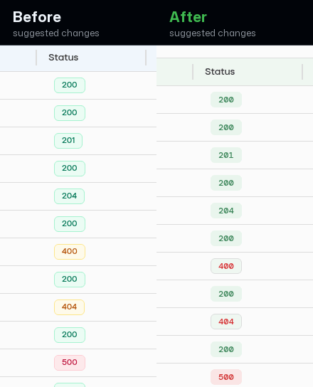
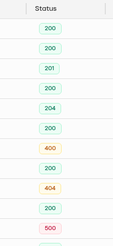
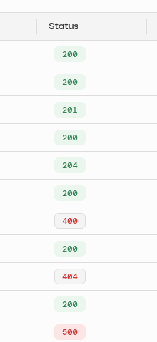
Status codes now make real failures stand outBefore, every non-200 status shared loud warning colors, so a routine 404 looked as alarming as a 500. Now success reads calm green, client errors sit quietly, and only true server failures show bold red — so real problems jump out while scanning the log. Prompt to fix with AI |
Softlight OverviewTo run Softlight again, comment @softlight. UX Score: 3/5Suggested fixes
Redesign The self-hosted dashboard read as unfinished — floaty stat cards, off-brand log colors, and a sign-in button that looked disabled — so this pass tightened the hierarchy and made both screens feel intentional.
|


Product recordingsSign in to the self-hosted dashboard Review the request logs on the Requests dashboard |
4 participants


Fresh clean test PR for hosted Design Doctor rerun testing.
Benchmark note: Self-hosted dashboard and admin auth.
Do not merge. This PR exists so Design Doctor can be run against a clean pull request with no prior review artifacts.