

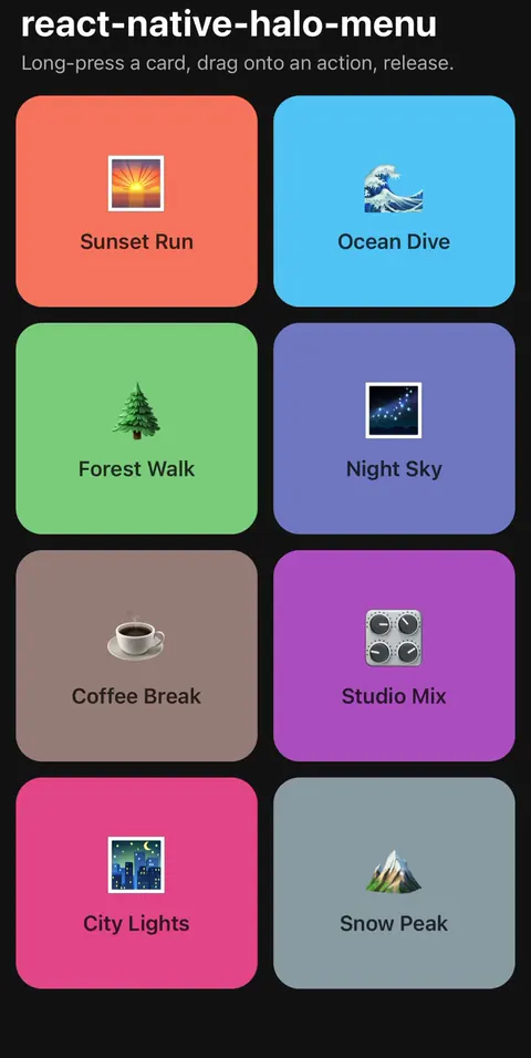
Pinterest-style hold menu for React Native: long-press, drag, release. A radial action menu powered by Reanimated 4 and Gesture Handler. Zero native code, compatible with Expo and bare React Native.
60 fps, captured on a real iPhone. Full-quality MP4.
Long-press a card → it lifts and tilts above a dimmed backdrop while an arc of action buttons fans out around your finger → drag onto a button → release to trigger. One continuous gesture.
- 🫳 One gesture: open, browse, and select without lifting your finger
- 🪂 Levitating preview: the pressed element lifts, tilts toward the screen edge, and casts a real shadow while everything behind dims
- 🏎️ Everything on the UI thread: per-frame finger tracking, hit-testing, and button placement run as Reanimated worklets
- 🎨 Themeable without forking: colors, motion, layout, backdrop, icons, and shadows are all injection points with sensible defaults
- 📳 Bring your own haptics:
onOpenandonHovercallbacks takeexpo-hapticsor anything else - ♿ Accessible: actions double as native accessibility actions for screen readers, and every animation respects OS Reduce Motion
- 🧪 Testable: ships a Jest mock at
react-native-halo-menu/mockwith working accessibility actions
npm install react-native-halo-menu
# or
pnpm add react-native-halo-menu
Peer dependencies (you almost certainly have them already):
npx expo install react-native-reanimated react-native-worklets react-native-gesture-handler react-native-safe-area-context| Requirement | Version / note |
|---|---|
| react-native | >= 0.81, New Architecture (inherited from Reanimated 4) |
| react-native-reanimated | >= 4.0 |
| react-native-worklets | matching your Reanimated minor |
| react-native-gesture-handler | >= 2.16 < 3.0 (RNGH 2 builder API) |
| react-native-safe-area-context | >= 4.0; SafeAreaProvider recommended (falls back to 0 insets) |
| Runtime dependencies | none; host libraries stay as peers |
| Native code | none in this package |
| Expo | Expo Go when the host SDK includes compatible peers |
| Bare React Native | supported when RNGH/Reanimated/Worklets are set up |
Your app must be wrapped in GestureHandlerRootView (Expo Router templates already do this).
Expo projects get the Reanimated/Worklets Babel setup from babel-preset-expo. Bare React Native
apps need the worklets Babel plugin (see the Reanimated install docs for your version):
// babel.config.js (bare React Native)
module.exports = {
  presets: ["module:@react-native/babel-preset"],
  plugins: ["react-native-worklets/plugin"], // must be last
};
Optional Expo helpers live behind a subpath and are never imported by the core entry:
npx expo install expo-blurUse expo-blur only if you import react-native-halo-menu/expo; use any haptics library by
passing callbacks to the provider.
Wrap your app once in HaloMenuProvider, inside your GestureHandlerRootView and above your
navigator, the same pattern as @gorhom/bottom-sheet's BottomSheetModalProvider. The provider
renders the halo overlay (backdrop, lifted preview, radial buttons) as a full-screen
pointerEvents="none" layer at the root, so the pan gesture never leaves the trigger.
// 1. Mount the provider once, near the root (inside GestureHandlerRootView,
//    and inside SafeAreaProvider if your app has one).
import { HaloMenuProvider } from "react-native-halo-menu";

export function App() {
  return (
    <HaloMenuProvider>
      <Screens />
    </HaloMenuProvider>
  );
}

// 2. Wrap anything long-pressable in a trigger.
import { HaloMenuTrigger, HaloMenuPreviewFrame } from "react-native-halo-menu";

function Card({ item }) {
  return (
    <HaloMenuTrigger
      id={item.id}
      actions={[
        { key: "share", title: "Share", onPress: () => share(item) },
        { key: "save", title: "Save", onPress: () => save(item) },
        { key: "delete", title: "Delete", destructive: true, onPress: () => remove(item) },
      ]}
      renderPreview={({ width, height }) => (
        <HaloMenuPreviewFrame width={width} height={height} borderRadius={16}>
          <CardContent item={item} />
        </HaloMenuPreviewFrame>
      )}
      accessible
      accessibilityRole="button"
      accessibilityLabel={item.title}
      accessibilityHint="Shows quick actions"
    >
      <CardContent item={item} />
    </HaloMenuTrigger>
  );
}
That's it. Long-press the card and drag.
renderPreview is optional: omit it and the trigger re-renders its children inside a default
HaloMenuPreviewFrame. Pass your own renderer to control the corner radius, inset, or content.
Everything app-specific is an injection point on the provider:
<HaloMenuProvider
  colorScheme="dark"                          // defaults to the OS scheme
  colors={{ foreground: "#fff", surface: "#1c1c1e", destructive: "#ff453a" }}
  motion={{ longPressDuration: 250, liftScale: 1.2 }}
  layout={{
    buttonSize: 54,
    iconSize: 24,
    radius: 92,
    hitRadius: 42,
    arcGapDegrees: 48,
  }}
  appearance={{
    buttonShadowOpacity: 0.14,                // 0 disables default button shadow
    previewShadowOpacity: 0.28,               // 0 disables default preview shadow
    showOriginDot: true,
    originDotOpacity: 0.22,
  }}
  haptics={{
    onOpen: () => Haptics.notificationAsync(Haptics.NotificationFeedbackType.Success),
    onHover: () => Haptics.selectionAsync(),
  }}
  renderBackdrop={({ visible, isDarkMode }) => <MyBlurBackdrop visible={visible} />}
  labelTextStyle={{ fontFamily: "SpaceMono-Bold" }}
  suppressActivationWhen={navTransitioning}   // SharedValue gate during transitions
>colors, renderBackdrop, labelTextStyle, and haptics are reactive. motion, layout, and
appearance are latched at mount: the never-recreated gesture closure captures them once, so
runtime changes to those three are intentionally ignored. SharedValue props
(suppressActivationWhen, the trigger's disabledWhen / fallbackWidth / fallbackHeight) are
latched by identity: mutate their .value, don't swap in a new SharedValue.
Per-action icons are a render prop, so any icon system works:
{
  key: "share",
  title: "Share",
  onPress: share,
  renderIcon: ({ size, color }) => <Feather name="share" size={size} color={color} />,
}The core package uses a solid dim by default. For Expo apps that want frosted glass, install
expo-blur and import the optional helper:
import { HaloMenuProvider } from "react-native-halo-menu";
import { HaloBlurBackdrop } from "react-native-halo-menu/expo";

<HaloMenuProvider
  renderBackdrop={(props) => (
    <HaloBlurBackdrop
      {...props}
      intensity={50}
      tint={props.isDarkMode ? "systemMaterialDark" : "systemMaterialLight"}
      overlayColor={props.isDarkMode ? "rgba(0,0,0,0.24)" : "rgba(255,255,255,0.18)"}
      blurReductionFactor={3}
    />
  )}
>
  <Screens />
</HaloMenuProvider>;
HaloBlurBackdrop forwards Expo Blur props such as blurMethod, blurTarget, and
blurReductionFactor, while keeping expo-blur out of the main entry point.
When the measured view must differ from the gesture host (hero layouts, FlashList cells with recycled dimensions, deferred actions), use the hook directly:
const { panGesture, animatedRef, menuActiveRef } = useHaloMenuTrigger({
  id: item.id,
  actions,
  renderPreview,
  fallbackWidth,
  fallbackHeight, // SharedValues for recycled cells
  disabledWhen: isMultiSelectMode, // SharedValue gate
  interceptAction: (action) => action.key === "select", // defer until close
  onCloseComplete: fireDeferredAction,
  hideOnUnmount: true,
});const { visible, hide } = useHaloMenu(); // visible is a SharedValue<boolean>| Export | Kind | Purpose |
|---|---|---|
HaloMenuProvider |
component | Root overlay + configuration |
HaloMenuTrigger |
component | Long-press wrapper (the 90% case) |
useHaloMenuTrigger |
hook | Full-control escape hatch |
HaloMenuPreviewFrame |
component | Lift/tilt/shadow frame for previews |
useHaloMenu |
hook | { visible, hide } |
getHaloMenuAccessibilityProps |
function | Screen-reader action props for hook users |
DEFAULT_MOTION |
constant | The default motion values |
DEFAULT_LAYOUT |
constant | The default geometry values |
DEFAULT_APPEARANCE |
constant | The default visual values |
HaloBlurBackdrop from react-native-halo-menu/expo |
component | Optional Expo blur backdrop |
HaloAction, HaloMenuColors, HaloMenuMotion, … |
types | Full TypeScript surface |
Up to 5 actions render per menu (the arc gets ambiguous beyond that); extras are dropped with a dev warning.
| Prop | Purpose |
|---|---|
colors |
Override foreground, surface, destructive, and selected-icon colors |
colorScheme |
Force "light" / "dark"; defaults to the OS scheme |
motion |
Long-press duration, open/close timing, lift scale, tilt, stagger |
layout |
Button size, icon size, radius, hit radius, arc spacing, edge behavior |
appearance |
Button/preview styles, shadow strength, origin-dot styling |
haptics |
Optional sync/async onOpen / onHover callbacks; no haptics library is bundled |
renderBackdrop |
Replace the default solid backdrop with blur, gradients, or custom views |
labelTextStyle |
Override the floating hover-label typography |
suppressActivationWhen |
SharedValue gate for navigation transitions or disabled app states |
overlayContainerComponent |
Wrap the overlay, e.g. iOS FullWindowOverlay above native modals |
onWarn |
Replace dev warnings with your logger |
Haptic callbacks are fail-soft: thrown errors and rejected promises are reported once per provider
through onWarn, then ignored so an optional native integration cannot interrupt the gesture.
The example app does not enable haptics by default because haptics require a native module in the
host dev build; add callbacks in your app after installing and rebuilding your haptics dependency.
| Prop | Purpose |
|---|---|
id |
Stable trigger id; recommended for virtualized/recycled list cells |
actions |
Up to 5 HaloAction items |
renderPreview |
Optional; defaults to children inside a HaloMenuPreviewFrame |
| View props | All ViewProps forward to the measured wrapper (style, testID, ...) |
accessible props |
Native accessibility action fallback for each halo action |
| Hook options | disabledWhen, fallbackWidth, interceptAction, lifecycle hooks |
| Prop | Purpose |
|---|---|
width / height |
Measured trigger size; forward them from renderPreview |
inset |
Padding between the measured bounds and the clipped preview |
borderRadius |
Corner radius of the clipped preview (default 32) |
style / contentStyle |
Styles for the positioned wrapper / clipped content |
shadowOpacity |
Per-frame override of the provider's preview shadow multiplier |
type HaloAction = {
  key: string;
  title: string;
  destructive?: boolean;
  onPress: () => void | Promise<void>;
  renderIcon?: (props: { size: number; color: string; selected: boolean }) => ReactNode;
};| Import | Use when |
|---|---|
react-native-halo-menu |
Core provider, trigger, hooks, frame, types, defaults |
react-native-halo-menu/expo |
Optional Expo helpers such as HaloBlurBackdrop |
react-native-halo-menu/mock |
Jest mocks for app tests |
react-native-halo-menu/package.json |
Tooling that needs package metadata |
A hold-drag-release gesture is inherently invisible to assistive technology, so the package ships an explicit fallback instead of pretending otherwise:
- Screen readers (VoiceOver / TalkBack). Mark the trigger
accessiblewith anaccessibilityLabel, and every halo action is exposed as a native accessibility action, so users pick them from the rotor/actions menu without performing the gesture. This is opt-in because making the wrapper accessible flattens its children for screen readers; enable it per trigger as shown in the Quickstart.useHaloMenuTriggerusers get the same mapping fromgetHaloMenuAccessibilityProps(actions, { interceptAction }); spread the result onto the measured view. - Reduced motion. Every animation passes
ReduceMotion.System, so the OS setting disables the lift/stagger/fade transitions. - Motor access. The gesture itself requires holding and dragging with one finger. There is
no sticky-selection mode yet; the accessibility actions above are the alternative path, and
motion.longPressDuration/layout.hitRadiuscan be tuned to make the gesture more forgiving. - The overlay is hidden from the accessibility tree (
importantForAccessibility), since selection happens under the user's finger; nothing in the menu needs AT focus.
// jest.setup.js
jest.mock("react-native-halo-menu", () => require("react-native-halo-menu/mock"));

// If you import the optional Expo helpers, mock the subpath too:
jest.mock("react-native-halo-menu/expo", () => ({ HaloBlurBackdrop: () => null }));
The mocked HaloMenuTrigger renders a plain View that keeps style, testID, and
accessibility props, including working accessibility actions, so you can drive menu actions
in tests without the gesture:
fireEvent(screen.getByTestId("card-1"), "accessibilityAction", {
  nativeEvent: { actionName: "halo-menu:share" },
});
Using the bare react-native Jest preset (not jest-expo)? This package ships untranspiled
ESM, so add it to your transform allowlist:
transformIgnorePatterns: [
  "node_modules/(?!(react-native-halo-menu|(jest-)?react-native|@react-native(-community)?)/)",
],Make sure the app is wrapped with GestureHandlerRootView as close to the app root as possible.
For native modals, wrap the modal content in its own GestureHandlerRootView.
This means the consumer app is not transforming worklets. Expo apps should use
babel-preset-expo; bare React Native apps should follow the Reanimated/Worklets Babel setup for
their installed version. Also stop Metro and restart with a cleared cache after changing Babel
config.
Metro is running from the library root instead of example/. Stop all Metro servers and restart
from the example:
pkill -f "expo start"
pnpm --dir example start:dev-client -- --tunnel --clearThe overlay renders in the root view hierarchy. Triggers inside a native modal
(RN <Modal>, Expo Router presentation: "modal" / formSheet routes) will lift below
that modal. On iOS you can render the overlay above native modals with react-native-screens'
FullWindowOverlay:
import { FullWindowOverlay } from "react-native-screens";

const OverlayHost = ({ children }) =>
  Platform.OS === "ios" ? <FullWindowOverlay>{children}</FullWindowOverlay> : <>{children}</>;

<HaloMenuProvider overlayContainerComponent={OverlayHost}>
(Alternatively, mount a second HaloMenuProvider inside the modal's content, with its own
GestureHandlerRootView, per the Gesture Handler docs.)
If you want the native platform context menu (UIMenu / Material), use
zeego or @react-native-menu/menu. They're excellent and complementary.
If you're coming from
react-native-hold-menu (a list-style
hold menu, currently unmaintained and on Reanimated 2), this package covers the same
hold-to-act gesture with a radial drag-to-select layout on the current Reanimated 4 stack.
This package is for the gesture-layer menu: touch-first power actions on cards and grids
where you want full visual control and a single fluid gesture.
A runnable showcase lives in example/:
pnpm install
pnpm --dir example start   # then open in Expo Go or a dev build
To run it on a physical iPhone with the current SDK, use a development build:
cd example
npx eas device:create
npx eas build --platform ios --profile development
pnpm start:dev-client -- --tunnel
Install the EAS build from the link on your iPhone, open the installed app, then connect it to the dev server. Public App Store Expo Go can lag the latest Expo SDK; development builds are the recommended real-device path for validating gestures and blur. Haptics can be validated in a host app after installing and rebuilding the native haptics dependency.
Use pnpm --dir example start --lan instead of --tunnel when local network discovery works
reliably; --tunnel is slower but more dependable across restricted Wi-Fi networks. If Metro
logs that it bundled lib/module/index.js, see
Troubleshooting.
The npm package ships only runtime/library artifacts and consumer-facing support files:
lib/compiled JavaScript and TypeScript declarationssrc/TypeScript source for thesourceexport condition used by modern RN toolingmock.js/mock.d.tsfor Jestllms.txt,README.md,CHANGELOG.md,LICENSE, andpackage.json
It does not ship runtime dependencies, the example app, CI config, generated native projects,
tests, or local build artifacts. pnpm run package:files:check enforces this before release.
- Expo Snack once the public Expo Go runtime matches the demo dependencies
- Real-device interaction matrix for iOS and Android releases
- Gesture Handler 3 hook-API build after Expo SDK support and real-device validation
MIT © Adrian Gruber